Thursday, January 28, 2010

Text as textures


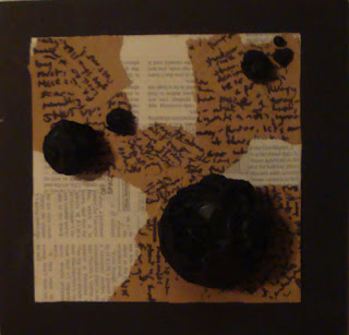
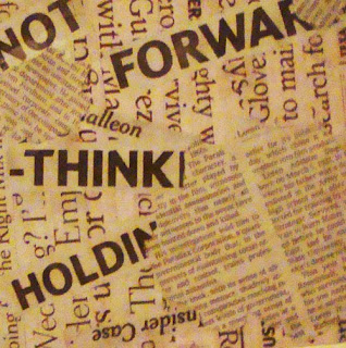
My number one texture was selected because I felt the brown scratch paper and newsprint really worked well together, as well as the vary texts between the two, as the bolder, messier handwritten text poses a nicer contrast to the orderly newsprint. I did experiment with just newsprint and and just brown scratch paper, but they were much stronger combined; I also experimented with not creating some sort of flow or movement with the different mediums, but felt that the flow created by the brown paper emphasize the directions the dots in the Proximity idea the best. The nine below show my other texts as textures, the one posted right below came to a close second to being my choice because of a similar contrast between being bold and orderly.


Wednesday, January 20, 2010

listen and choose

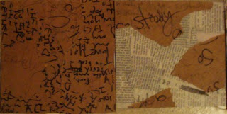
My final four consist of two picked from the group and two that I decided to use. I disagreed on the Similarity and Difference mainly because I felt that the dots utilized in my pick conveyed a much stronger message in the method with the dramatic differences between the sizes, whereas the group pick felt it needed work. I also disagreed on Proximity, as I felt the group pick felt too heavy on one end and lack movement as well as good use of the space, and that my pick had compromised the two problems with more balance in said areas. I did agree with the group picks on Closure and Continuance, as I felt both worked with either method without feeling like it needed way too much revision.

My classmates' picks:


(Note: the three other dots in my Sim. and Dif., (top right), are so small, that they weren't even visible in the picture. Sorry for the inconvenience.)

observations and speculations

The Quilt-
Handcrafted, not perfectly measured/constructed
There's and intended pattern, lots of different fabrics were involved in the construction.
It's very worn- probably used. Probably old.
There is texture from the wrinkles.
The pattern is geometric, constructed by bothe natural and geometic patterns in the fabric, and creates a focal point.
There is some 3-D elements: fabric that peaks off of the quilt.
Color rhythm is shown with the red squares.

The Painting-
Most likely a still-life, the display in the painting was probably constructed on purpose to look that way- very dramatic lighting.
It's a bit distorted, probably done on purpose as well, given there is obvious knowledge/mastery of the technique/medium of painting with oils.
The subjects in the painting were modern-like and simplistic- creates a mood/movemet/value/style in the piece.
The objects in the background are far more distorted and blurred out, probably to keep the focus/focal point on the objects in the light.
It was painted on wood, is actually a makeshift window frame with stretched canvas on it.
There is writing/information on the back.

Monday, January 18, 2010

dot dot dot

Similarity


Proximity


Continuance


Closure