Thursday, April 1, 2010

Contrasting traits project


In this project, we had to connect to opposing traits that define us in a sculpture, and I decided to go with maliciousness and sweetness, both of which are obviously reflected in the bear and the kitchen knives stabbing it. It took me five idea sketches to get to this since I was having artist's block with this assignment, and as soon as I had it reviewed and all the details down, I took the lightest-color bear in my closet and ripped it in half with an exacto knife. Keeping the cream color of the bear in mind, I purchased a quilt with a similar, soft color palette, but also trying to work with the deep red color of blood and maintaining the sense of child-like innocence and joy. After having that picked out, I created a structure to present the bear on the quilt, and made it out of card board and broken pencils to hold it at the 90 degree angle I needed it to be- yes, I'm cheap. I then draped the quilt on it to achieve some folds, hot-glued in place, laid the bear off-center, and then drenched it in my home-made blood, (ketchup, highly concentrated red water color, and water), all over the area I stabbed the bear to give it the effect of wounds, as well as flinging the blood all over the quilt to give it the effect of the stabbing action. As a finishing touch, I hot-glued old kitchen knives into the biggest wound-areas of the bear and adjusted them into varying angles to give it more of that 'malicious' effect.


Overall, the critique was well-receptive, and most agreed that my choices to use lighting and old, broken kitchen knives were good. However, they said they would've like to see more of those old kitchen knives included, as the newer-looking ones weren't as nice, and a different way to try this same idea is to use more or less knives, and to try to add more blood stain on the knives going into the bear.

Accordion (Dot) Book


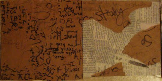
The textures selected for my accordion book reflect some ideas I had to implement my choice from our Gestalt final, and each two panels are designed to be very different from one another as you flip through it, mainly differing on uses of newspaper, paper bag material, or plain white paper and handwritten vs. typed. I made the accordion book by purchasing matte board and cutting it into 8x8" squares, and taping it together with black duck tape. I applied the different textures with spray glue.

Modular Madness

For my Modular Madness project, I used receipts that I've collected myself in the past year, and those that have been collected and donated from others. I took a suggestion and decided to make a wallet with a strap and pockets. I would've added decals such as credit cards, but I was phased by time as an issue and wasn't able to do so. My process began with a question on how to make the wallet, and decided to make a base of two cardboard pieces to hold the receipts better, since they are fairly delicate. I glued the receipt cover in a random order, starting with spray glue, (which left an odd texture), and then moved on to glue stick, and then combined a the two pieces with a layer of receipts to allow it the opening-closing function of a wallet. For the strap, I made a base with duck tape and shaped it accordingly, then tapered it in a similar fashion to the wallet base except with the color-sides showing to give it some 'style.' In order to allow the strap to contain the wallet, as well as be able to open and close, I applied Velcro, (which posed some problems do to the delicate nature of the receipts, and therefore had to make another layer). And finally, for the inside of the wallet, I made pockets with a base of tape and construction paper, and cut it accordingly to give the pockets the definition they needed to allow space inside them.


During the critique, I allowed my classmates the ability to interact with it, and asked for any chunk change to be disposed of into the wallet. I didn't make any money or any sympathy for, technically, having the most expensive project of the class, but they did like the fact that they could interact with my project. They say, however, that otherwise it would've been boring.


Wednesday, March 10, 2010

Dot Final

">Here it is.

This was surprisingly fun to make. I only wish there was more time to do more detailed work, like make the dots move more naturally, but I felt the choppy-ness worked out really well- especially with the song.

Wednesday, February 10, 2010

Saturday, February 6, 2010

Text as texture critique


The person that did the critique of mine said she liked that I combined handwritten text and newsprint, as well as how I created my dots out of crumbled paper, as she felt it added to the composition. I agreed with her, as it was my intention, and also about how I picked the best texture, although I was torn a bit with another that was all newsprint for awhile.


---

I did Jamie's piece, and I really liked her choice of texture, because it worked well with her dots' placement. My only recommendation was to try integrating the 3-D texture into the dots, because I felt you lost the dots a bit being 2-D, and adding the texture of the newsprint into the dots would've helped to bring them out more as well as add more balance to the piece. Also: she had eight dots. :P

Monday, February 1, 2010

To become a dot...

White space ideas:
-Table cloths/plastic
-White sheets
-Toilet paper/butcher paper
-Cardboard
-Spray paint
-White scraps of paper
-White concrete

Ways to be dots:
-Black dot masks
-Umbrellas
-Black clothes
-Black plastic
-Fist/hands- photoshop
-Dots on a T-shirt
-Lights and shadow contrasts
-Boxing gloves
-Tires with black trash bags
-Trash can lids

Ways to document:
-Film
-Photography
-Draw/sketch

Thursday, January 28, 2010

Text as textures


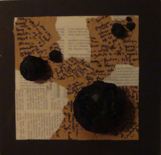
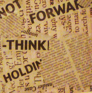
My number one texture was selected because I felt the brown scratch paper and newsprint really worked well together, as well as the vary texts between the two, as the bolder, messier handwritten text poses a nicer contrast to the orderly newsprint. I did experiment with just newsprint and and just brown scratch paper, but they were much stronger combined; I also experimented with not creating some sort of flow or movement with the different mediums, but felt that the flow created by the brown paper emphasize the directions the dots in the Proximity idea the best. The nine below show my other texts as textures, the one posted right below came to a close second to being my choice because of a similar contrast between being bold and orderly.


Wednesday, January 20, 2010

listen and choose

My final four consist of two picked from the group and two that I decided to use. I disagreed on the Similarity and Difference mainly because I felt that the dots utilized in my pick conveyed a much stronger message in the method with the dramatic differences between the sizes, whereas the group pick felt it needed work. I also disagreed on Proximity, as I felt the group pick felt too heavy on one end and lack movement as well as good use of the space, and that my pick had compromised the two problems with more balance in said areas. I did agree with the group picks on Closure and Continuance, as I felt both worked with either method without feeling like it needed way too much revision.

My classmates' picks:


(Note: the three other dots in my Sim. and Dif., (top right), are so small, that they weren't even visible in the picture. Sorry for the inconvenience.)

observations and speculations

The Quilt-
Handcrafted, not perfectly measured/constructed
There's and intended pattern, lots of different fabrics were involved in the construction.
It's very worn- probably used. Probably old.
There is texture from the wrinkles.
The pattern is geometric, constructed by bothe natural and geometic patterns in the fabric, and creates a focal point.
There is some 3-D elements: fabric that peaks off of the quilt.
Color rhythm is shown with the red squares.

The Painting-
Most likely a still-life, the display in the painting was probably constructed on purpose to look that way- very dramatic lighting.
It's a bit distorted, probably done on purpose as well, given there is obvious knowledge/mastery of the technique/medium of painting with oils.
The subjects in the painting were modern-like and simplistic- creates a mood/movemet/value/style in the piece.
The objects in the background are far more distorted and blurred out, probably to keep the focus/focal point on the objects in the light.
It was painted on wood, is actually a makeshift window frame with stretched canvas on it.
There is writing/information on the back.

Monday, January 18, 2010

dot dot dot

Similarity


Proximity


Continuance


Closure